Well, it's been a while since my last post, but if a tree falls in the woods and there's no one around to hear it, does it make a sound? Or something like that.
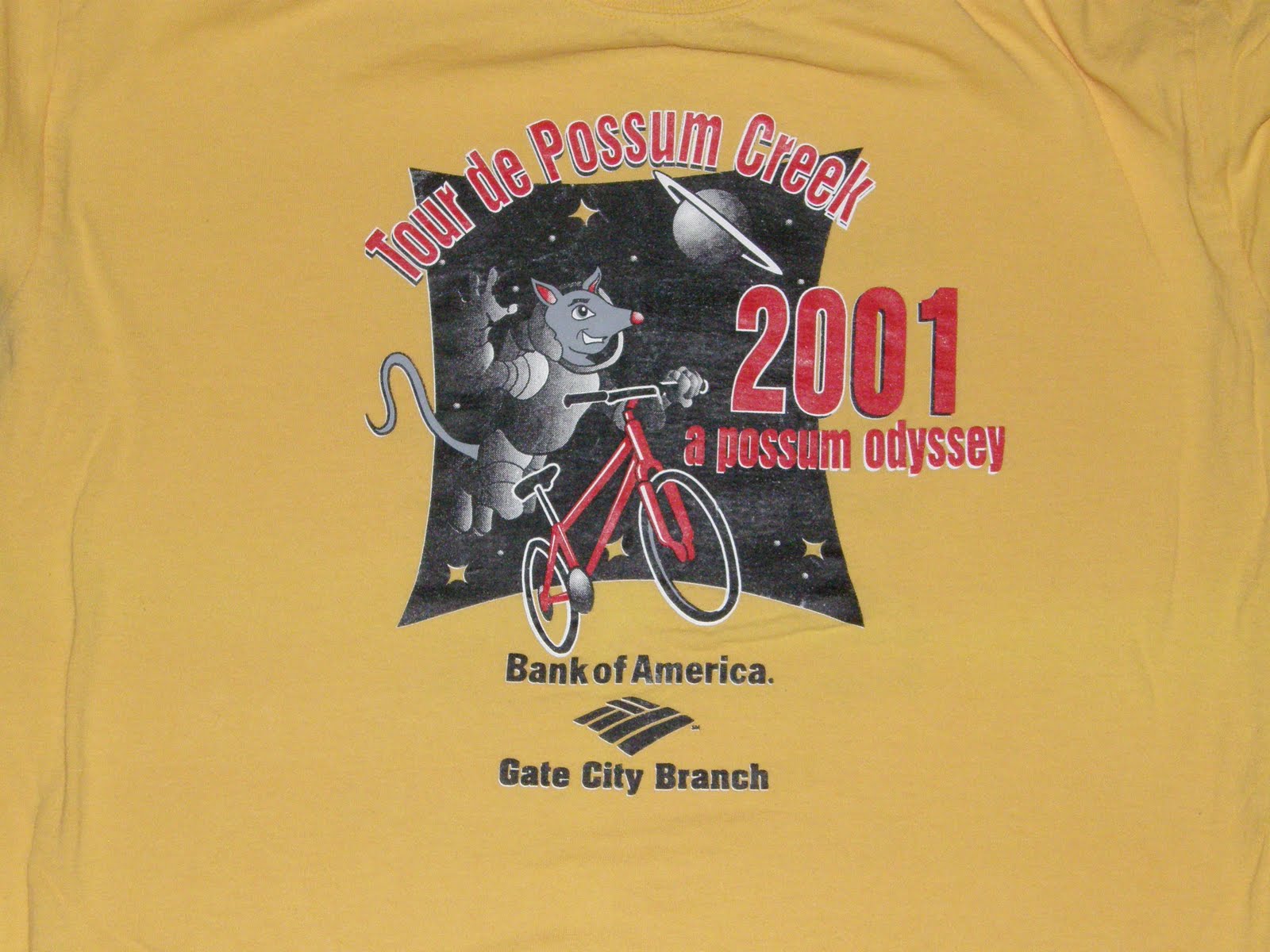
So, in 2001 the shirt designer got all clever with the "Possum Odyssey". Not a bad logo of the spacesuit-wearing possum floating in space with his bike. I wish that's how I felt while riding my bike, but it's far from it.
This is the only year of my TdPC shirt collection that the shirt wasn't white. Ummkay, why make it this hideous goldenrod?
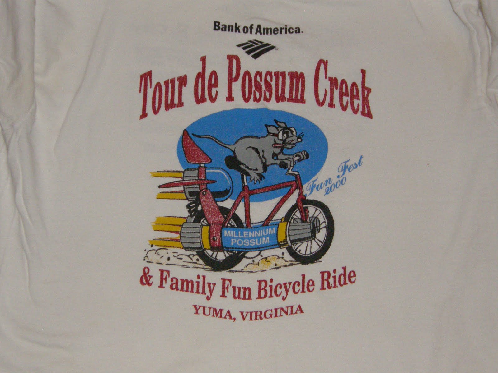
Well, here's the 2nd shirt in my Tour de Possum Creek series. It is from 2000, so of course it has the Millenium Possum riding what looks like a rocket-powered bike. I could've used one of those. This may be the year that my husband and I got there, saw a ride starting, and jumped in. Turned out it was the 40-miler instead of the 20ish one we'd signed up for. I was on a mt. bike and fell so far behind that the guys in the support vehicle told me a shortcut and sent me on my way.
This is the first shirt in my series of the Tour de Possum Creek shirts. This was a popular bike ride back home that was part of Kingsport, TN's FunFest. As you can tell from the shirt, this was the 2nd annual ride back in 1999. I'm not sure what the possum is doing. Is he changing a flat? Is he trying to avoid getting run over? He does look a little scared.
I did not see any possums, dead or living, on the ride.
Not sure what to grade the shirt. While the possum logo is unique, it's not really cute & cuddly and the colors are meh.
This is probably the best shirt I've gotten to date. It has a fantastic logo and an exquisite use of color.
I mean, look at that. It is awe-inspiring.
Okay, they may not be awe-inspiring, but they aren't bad in my humble opinion.
These are the shirts that we made for our run in the 2010 Great Urban Race. Teammates are supposed to match, so we bought some $3 t-shirts and some inkjet iron-on transfers at AC Moore. We then whipped up a logo and affixed it to the shirts. It was a bit of a challenge, because the transfers are white, so you have to either design the edges to be white or come up with something where you can completely wipe out any white. We chose the latter.
We coordinated the backs as well:
In case you don't get the name "My Ox Is Broken" I've included this handy video from The Amazing Race (about 40 seconds in):
I'll post the shirts we got at the race in a few days. They are pretty sharp.
I will refrain from grading the shirt, but I will say that the logos on the back could have been placed a little better, and that they don't breathe all that well when running around carrying a backpack.
Wednesday, April 14, 2010
This is my newest shirt. I think it's a pretty good-looking shirt. Good thing I registered when I did, because people that pre-registered after a certain date didn't get one. There was a "bouncer" turning people away left & right from the shirt table.
I'm not in love with the yellow, but the checkered flags and the blue are nice. Why are there checkered flags, you ask? This 5k took place on Lowe's Motor Speedway. The flat course was nice for a change and led to my best time since I started running again.
This was a fun race. The course was nice and flat and went through some interesting neighborhoods. You also get a free ticket to the Greek Festival. Oh, and the shirt is pretty nice. It has a nice dark red color. In fact, I don't have any other shirts this color which makes this a nice addition. The logo is pretty nice as well. It is a little hard to see in the picture, but that is a photo of the church in the center. It also says "orthopaedic" on the front. I think most people would agree that "orthopaedic" is a pretty cool word.
The only complaint is that it isn't tagless. Of course that is a problem which is easily solved
Of my collection of race T-shirts, this one gets the most use. That might have something to do with the fact that I don't have very many long sleeve T-shirts and that this winter was the coldest one in the 6 years I've lived in Charlotte.
It probably also has something to do with the fact that is isn't hidously ugly. I tend to wear shirts more frequently if they are moderately attractive than if they make me embarrased to be wearing them. You might be thinking to yourself "self, that the logo doesn't look like it belongs with something called the 'Jingle Jog'" and on another day you would right. But not today, my friend. The Jingle Jog is held in conjunction with Charlotte's Thunder Road Marathon so the tire tracks and checkered flags tie in nicely.
For some reason, the fact that this shirt is white doesn't bother me. Maybe it is because it is long-sleeve. I only have a couple of minor quibbles with this shirt. The tag was really itchy, but a pair of scissors took care of that. The material isn't 100% cotton, so it isn't as comfortable as it might be. The shirt I received also had a tiny pinhead sized stain on it when I received it. It really isn't noticable to anyone, but I know it is there. Wearing a stained shirt lowers my self-esteem.
This shirt is from my best age-group finish race. It also has the dubious distinction of being the ugliest in my closet. The logo doesn't look too bad - despite the lack of color (pic 1), but it is woefully undersized on the shirt (pic 2.) Never fear, the sponsors on the back are not only large enough to read, they are electric blue (pic 3), which doesn't really go with the myriad of browns on the front. Does it?
The Susan G. Komen Race for the Cure is a great cause. The event is well run and had a lot of other things to do on race day before and after the run. That is fortunate for me, since I was out with an injury and merely was there to support the runners. Since I had registered well in advance, I still got a race shirt.
The shirt is terrible. It is white and the design is ugly. If any race was begging for a non-white shirt, this would be it. Everyone knows that pink is the color for breast cancer awareness. Why not a pink shirt? If you make this shirt in pink and replace the "running ribbons" with a larger version of the top-of-shirt logo I would be much more likely to wear it than I am with the current design. I won't wear this shirt outside of the house.
This race is a much bigger production than most, so the big time sponsors get a place on the front of the shirt. Unfortunately for them they won't get the exposure since the shirt never gets seen.
This is one of my newest race shirts. I haven't even worn it yet. This shirt has a couple of things going for it: it has a nice logo (though, I guess some might think the curlicues are a little girly) and it is a dri-fit type technical fabric as opposed to a regular cotton tee.
It's not white, but this is one of those cases where white would have been better. The picture doesn't really do it justice, but this is easily the ugliest color I've ever seen on a race shirt. My friend said it wasn't really her color; well, I maintain it's not anybody's color.
This race benefits a good charity, so I will give the organizers the benefit of the doubt and think they got the shirts at a huge discount or even donated. But the question remains, why would a shirt company even make this color?
We are just starting out here at Race Shirts and we'll be posting more pictures and commentary on our shirts over the next days and weeks. Since I have only been running for a year, I will eventually run out of shirts to share. If you have a shirt you would like to share, go ahead and send an e-mail to raceshirt@gmail.com with the picture and a little background and we will put it up.
This is one of my nicer shirts. It almost makes up for the fact that they didn't actually measure the 36-mile bike ride before advertising it as 31. Nice colors, Fruit of the Loom - the only problem is it runs a little small. The back has the various sponsors listed. The best thing about this shirt is that when you are standing in front of a mirror, you see the word POOS.
As you might have guessed, this shirt comes from 2009's Summer Breeze 5K. You might also be able to tell by the wrinkles that this shirt has not been worn in a while. It is a Hanes tagless tee. So it has that going for it, which is nice. On the other hand it is white and the logo leaves a little something to be desired.
I will cut this shirt some slack, though. The sponsors pulled out so the local running store stepped in to save the day. They were good enough to save the race so it would be unfair to be too critical of the less-than-spectacular shirt.
Welcome to the Race Shirts blog. I started running last year and after a few months I began to run some races. My closet quickly began to fill up with race t-shirts. I thought it might be fun to begin to catalog the shirts in an online archive.
I never choose a race based on the shirt, but I must admit I get a little jealous when I hear that this race or that race has a really nice shirt since I'd have to classify my shirts anywhere from "so-so" to "absolutely unwearable".
It's understandable since most of these races are for charity and I'd rather not have the organizers waste a bunch of money on a t-shirt design when the money could be going to a better cause. It would be nice if they were something I would actually like to wear, though.
I want to see your shirts, too. Send your shirt picture to raceshirt@gmail.com and I'll put them on the site.