Wednesday, March 31, 2010

Turkey Trot


This shirt is from my best age-group finish race. It also has the dubious distinction of being the ugliest in my closet. The logo doesn't look too bad - despite the lack of color (pic 1), but it is woefully undersized on the shirt (pic 2.) Never fear, the sponsors on the back are not only large enough to read, they are electric blue (pic 3), which doesn't really go with the myriad of browns on the front. Does it?

Easy to grade: F

Sunday, March 28, 2010

Race for the Cure

The Susan G. Komen Race for the Cure is a great cause.  The event is well run and had a lot of other things to do on race day before and after the run.  That is fortunate for me, since I was out with an injury and merely was there to support the runners.  Since I had registered well in advance, I still got a race shirt.

The shirt is terrible. It is white and the design is ugly.  If any race was begging for a non-white shirt, this would be it.  Everyone knows that pink is the color for breast cancer awareness.  Why not a pink shirt?  If you make this shirt in pink and replace the "running ribbons" with a larger version of the top-of-shirt logo I would be much more likely to wear it than I am with the current design.  I won't wear this shirt outside of the house. 

This race is a much bigger production than most, so the big time sponsors get a place on the front of the shirt.  Unfortunately for them they won't get the exposure since the shirt never gets seen.

Cause: A
Shirt: F


Thursday, March 25, 2010

Run the Creek 5K

This is one of my newest race shirts. I haven't even worn it yet. This shirt has a couple of things going for it: it has a nice logo (though, I guess some might think the curlicues are a little girly) and it is a dri-fit type technical fabric as opposed to a regular cotton tee.

It's not white, but this is one of those cases where white would have been better. The picture doesn't really do it justice, but this is easily the ugliest color I've ever seen on a race shirt. My friend said it wasn't really her color; well, I maintain it's not anybody's color.

This race benefits a good charity, so I will give the organizers the benefit of the doubt and think they got the shirts at a huge discount or even donated. But the question remains, why would a shirt company even make this color?

Grade:
Logo - A
Fabric - A
Color - D-

Wednesday, March 24, 2010

Send in the shirts

We are just starting out here at Race Shirts and we'll be posting more pictures and commentary on our shirts over the next days and weeks.  Since I have only been running for a year, I will eventually run out of shirts to share.  If you have a shirt you would like to share, go ahead and send an e-mail to raceshirt@gmail.com with the picture and a little background and we will put it up.

In the meantime, here are some other nice race shirts.

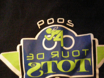
Tour de Tots


This is one of my nicer shirts. It almost makes up for the fact that they didn't actually measure the 36-mile bike ride before advertising it as 31. Nice colors, Fruit of the Loom - the only problem is it runs a little small. The back has the various sponsors listed. The best thing about this shirt is that when you are standing in front of a mirror, you see the word POOS.

Grade: A

Tuesday, March 23, 2010

Summer Breeze 5K


As you might have guessed, this shirt comes from 2009's Summer Breeze 5K. You might also be able to tell by the wrinkles that this shirt has not been worn in a while. It is a Hanes tagless tee. So it has that going for it, which is nice. On the other hand it is white and the logo leaves a little something to be desired.

I will cut this shirt some slack, though. The sponsors pulled out so the local running store stepped in to save the day. They were good enough to save the race so it would be unfair to be too critical of the less-than-spectacular shirt.

Grade: C-

Monday, March 22, 2010

Great Harvest Bread 5K


So here's my first race t-shirt. It is probably the best one I have as well. It is from the 2009 Great Harvest Bread 5K in Charlotte, NC.

Let's see what it has going for it:

  1. It isn't white
  2. It is tagless
  3. It is a Hanes T-shirt. Quality!
  4. The logo isn't bad
It is pretty simple. The name of the race, the year, the logo, and nothing else.

The back is the usual list of sponsors.

Grade: A


Welcome

Welcome to the Race Shirts blog. I started running last year and after a few months I began to run some races. My closet quickly began to fill up with race t-shirts. I thought it might be fun to begin to catalog the shirts in an online archive.

I never choose a race based on the shirt, but I must admit I get a little jealous when I hear that this race or that race has a really nice shirt since I'd have to classify my shirts anywhere from "so-so" to "absolutely unwearable".

It's understandable since most of these races are for charity and I'd rather not have the organizers waste a bunch of money on a t-shirt design when the money could be going to a better cause. It would be nice if they were something I would actually like to wear, though.

I want to see your shirts, too. Send your shirt picture to raceshirt@gmail.com and I'll put them on the site.