Sunday, January 16, 2011

Great Urban Race 2


Eight months after posting our team's shirts for the 2010 Great Urban Race, demand has finally forced me to post the shirts that we got from the Great Urban Race as part of our race packet.

The front of the shirt has a logo with all of the cities for 2010 along with some race-related words (Race, Fun, etc.). I like the logo but I have the minor complaint that "Charlotte" is in fairly small print.  I think it should dominate the shirt.

The back is the schedule of all the 2010 races, similar to a concert T-shirt.


As you can see, the shirt is black.  As previously mentioned, I prefer almost any color to white, so that is a plus.

We have already signed up for this year's race so that shirt will get posted some time in 2012.

Grade: B+


Tuesday, July 27, 2010

2001 Tour de Possum Creek


Well, it's been a while since my last post, but if a tree falls in the woods and there's no one around to hear it, does it make a sound? Or something like that.

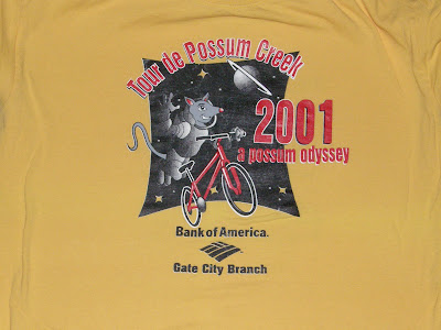
So, in 2001 the shirt designer got all clever with the "Possum Odyssey". Not a bad logo of the spacesuit-wearing possum floating in space with his bike. I wish that's how I felt while riding my bike, but it's far from it.

This is the only year of my TdPC shirt collection that the shirt wasn't white. Ummkay, why make it this hideous goldenrod?

Friday, May 21, 2010

Tour de Possum Creek 2000


Well, here's the 2nd shirt in my Tour de Possum Creek series. It is from 2000, so of course it has the Millenium Possum riding what looks like a rocket-powered bike. I could've used one of those. This may be the year that my husband and I got there, saw a ride starting, and jumped in. Turned out it was the 40-miler instead of the 20ish one we'd signed up for. I was on a mt. bike and fell so far behind that the guys in the support vehicle told me a shortcut and sent me on my way.

Wednesday, April 28, 2010

Tour de Possum Creek 1999

This is the first shirt in my series of the Tour de Possum Creek shirts. This was a popular bike ride back home that was part of Kingsport, TN's FunFest. As you can tell from the shirt, this was the 2nd annual ride back in 1999. I'm not sure what the possum is doing. Is he changing a flat? Is he trying to avoid getting run over? He does look a little scared.

I did not see any possums, dead or living, on the ride.

Not sure what to grade the shirt. While the possum logo is unique, it's not really cute & cuddly and the colors are meh.

Stay tuned for more exciting possum scenes!

Monday, April 26, 2010

Great Urban Race 1


This is probably the best shirt I've gotten to date.  It has a fantastic logo and an exquisite use of color.


I mean, look at that.  It is awe-inspiring. 

Okay, they may not be awe-inspiring, but they aren't bad in my humble opinion.

These are the shirts that we made for our run in the 2010 Great Urban Race.  Teammates are supposed to match, so we bought some $3 t-shirts and some inkjet iron-on transfers at AC Moore.  We then whipped up a logo and affixed it to the shirts.  It was a bit of a challenge, because the transfers are white, so you have to either design the edges to be white or come up with something where you can completely wipe out any white.  We chose the latter.

We coordinated the backs as well:


In case you don't get the name "My Ox Is Broken" I've included this handy video from The Amazing Race (about 40 seconds in):


I'll post the shirts we got at the race in a few days.  They are pretty sharp.

I will refrain from grading the shirt, but I will say that the logos on the back could have been placed a little better, and that they don't breathe all that well when running around carrying a backpack.

Wednesday, April 14, 2010


This is my newest shirt. I think it's a pretty good-looking shirt. Good thing I registered when I did, because people that pre-registered after a certain date didn't get one. There was a "bouncer" turning people away left & right from the shirt table.

I'm not in love with the yellow, but the checkered flags and the blue are nice. Why are there checkered flags, you ask? This 5k took place on Lowe's Motor Speedway. The flat course was nice for a change and led to my best time since I started running again.

I'll give it an A.

Friday, April 9, 2010

Yiasou Greek Festival 5K

This was a fun race.  The course was nice and flat and went through some interesting neighborhoods.  You also get a free ticket to the Greek Festival.  Oh, and the shirt is pretty nice.  It has a nice dark red color.  In fact, I don't have any other shirts this color which makes this a nice addition.  The logo is pretty nice as well.  It is a little hard to see in the picture, but that is a photo of the church in the center.   It also says "orthopaedic" on the front.  I think most people would agree that "orthopaedic" is a pretty cool word.

The only complaint is that it isn't tagless.  Of course that is a problem which is easily solved

Grade: A-